One of our ecommerce clients has over 70% of their website traffic coming to the site via mobile phone; there is no denying that mobile traffic has become absolutely HUGE. But the sobering reality for ecommerce sites is that mobile conversion rates continue to lag behind desktop conversion rates. How can we fix that?
It’s essential that we look at desktop and mobile visitors as two different sales experiences because they are. These quick tips can help you improve your mobile conversion rates.
Mobile users surpassed desktop users back in 2014 and smartphone use continues to increase. During the 2016 holiday season, $28.43 billion in revenue was generated from ecommerce transactions on mobile devices. This was a 23% year-over-year increase from 2015.

Here are some quick tips on how you can increase your mobile conversion rates:
1. Streamline Your Mobile Design
Before you get into A/B testing your shopping cart, you need to take a step back and make sure your site is mobile-friendly. The best way to create a smooth mobile experience is to eliminate the distractions of your design. In a study of those who abandoned shopping carts, 28% said that it was too difficult to use the retailer’s mobile site to make a purchase.
Your mobile website experience needs to be reviewed often to ensure that it’s an easy process for those on the small screen, who may also be on the go.
Mobile Website Design Tips:
- Be thumb-friendly; consider the “thumb zone” on different screen sizes;
- Make navigation easy to access and click;
- Quick links to top pages / minimal clicking to access any page;
- Great search functionality;
- Simple design with little clutter;
- Optimize Images for mobile;
- Easy access to contact info;
- Have fast page load times.
A slow-loading site is just as bad as a poorly designed site. Mobile users are especially fickle and if they’re browsing your site to find products, they’re not going to stick around if your site loads slowly. Site speed is also an important ranking factor. Quick sites rank better and convert more.
Cut out non-important graphics and remove social widgets or unnecessary navigational elements from the check-out process to help keep things running quickly.
It’s always a good idea to run your URL through Google’s Mobile-Friendly Test to make sure that Google is seeing your website as being “Mobile Friendly.” If it’s not, you’ll get a good summary of where to start to improve it.
2. Create a Seamless Cross-Device Shopping Experience
Your mobile traffic, desktop traffic, and tablet traffic are not necessarily exclusive to each other. A study in the UK found that the average household has 7 internet-connected devices. When someone is shopping your site they might start doing some research on their tablet in the evening, then check some competitors on their phone in the morning commute, then make a purchase while sitting at their desk at work.
Here are some great reasons to make sure you’re facilitating a cross-device experience:
- Mobile visitors make up 59% of sessions on ecommerce sites BUT
- Mobile visitors only make up 38% of revenue.
- Tablet devices account for the highest add-to-cart rates on ecommerce sites, at 8.58%.
- 51% of ecommerce shoppers prefer to check out on a desktop.

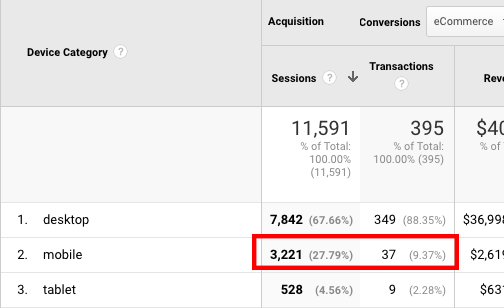
You can see that mobile transactions to visits are only about a third for this particular site.
If your users are switching devices or coming before they complete their purchase, you need to facilitate that and make their conversion funnel multi-device-friendly.
- Remember their search history and favorites
- Make personalization present on any device
- Allow for easy login across devices
- Keep users logged in
3. Make Your Checkout As Easy As 1-2-
Smartphone users are generally more impatient than desktop users and become frustrated quicker if a website is slow, a form is too long, or there are too many steps in a checkout process.
21% of shoppers abandon their cart because it takes too long to make a purchase. If you have unnecessary steps in your checkout, cut them out. Follow the principles of KISS and Keep It Simple.
- Allow check out as guest. Don’t make people create an account before they can check out.
- Cut down form fields.
- Make form errors clear and concise, and keep already entered information present when you load the errors. No one wants to fill out your form more than once!
- Let billing/shipping addresses default. Give the option to specify two, but make users only enter one by default.
- Include a progress bar. If you have multiple steps/pages, let people know. You’re going to get drop-off with each additional step/page so make sure you let your customers know that they are almost done.
- Quick Buy! One-click Add-to-Cart + Checkout FTW.
It’s also important to remember that all the great cross-sell and up-sell opportunities that you’re using on desktop checkout don’t always apply well to the mobile experience. From the testing we’ve done with our own clients, we recommend stripping out any distracting or unnecessary pop-ups or promotions from your mobile cart to keep the mobile check-out smooth.
It’s generally best to treat your mobile checkout and desktop checkout differently, as they really should be two different checkout experiences.
4. Take the Money
Having the right payment methods that your visitors want to use is important. Making it to the checkout and then finding out you can’t actually pay is incredibly frustrating to shoppers. This can cost you the sale as well as the customer.
Alternative payment methods, like PayPal, Google Wallet, or Apple Pay, are great because they allow one-click payment options for shoppers and allow them to make payments on the go. Even having to get up to go get your wallet to type in all that credit card info can be a deterrent, so simple payment options are going to help boost your conversion rates.
Some informal tests have shown that having all major payment options available increased smartphone conversion rates by 15%.
These four easy steps don’t require a lot of development time and designer mock-ups to A/B test. In fact, they’re pretty much the opposite: strip down your site to provide a simple user experience on a clean design with minimal customer input. Follow these tips and you’re sure to see your visitors making it further through the conversion funnel!
Any other great tips that are easy to implement? Let me know in the comments.


