Ecommerce
Optimizing Mobile Ecommerce Links
Using effective links in ecommerce websites is easy! Increase your conversions with these simple tips.
Internal links are important to keep visitors moving through your site and to encourage them to complete the checkout process, but this doesn’t always translate well on a mobile site. Text links can get smooshed up on a mobile device, and if it’s hard to complete a transaction, your conversion rate is going to drop. You want to make them big enough to click but small enough not to be intrusive.
Remember that a thumb can only reach so far. Your optimized mobile shopping experience should be thumb-friendly. This is the average “thumb comfort zone” for most people, and your conversion items should be within the comfortable green zone.
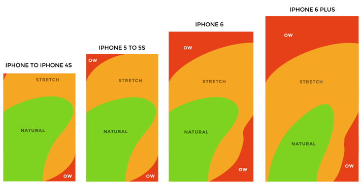
You need to make sure your links are in that nice green “thumb friendly” zone that’s easy to click and you want to make sure that an un-agile thumb is able to easily click the correct item.
So what can you do to your links friendly to keep the mobile experience strong? Use buttons! Not only are buttons easier to click, but you can really make them stand out more by using colors to draw the eye and encourage the click-through.
Buttons instead of text links are a thumb-friendly solution to keep the visitor moving through the conversion funnel without getting frustrated. When you keep your links text-based, and if that text is teeny tiny on your mobile site, your users are going to get frustrated.
Color your buttons to encourage the user to take the actions you want. Add to cart! Check it out now!
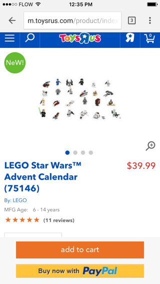
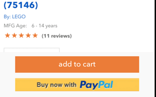
Toys-R-Us is doing it right with their button colors. The “Add to cart” button is darker and more prominent, while the “Buy now with PayPal” button is a little lighter and lower on the page. Both options are facilitating the completion of the sale.
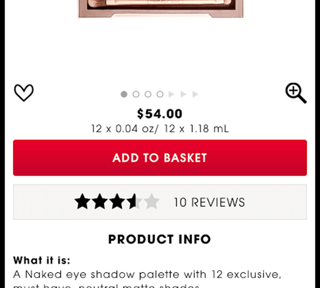
There are loads of other online shopping examples with good use of buttons and colors to facilitate online sales. Here’s Sephora with their primary “Add to Basket” button and a secondary “Reviews” button.
You don’t want to load up your page with too many buttons, but even too many buttons are better than too many small links that you have to resize your screen to click accurately.
One simple change can make a huge difference. If you haven’t checked out your mobile experience lately, go do it RIGHT NOW and see if there are any elements you should turn into buttons to encourage conversion.

The HubSpot Agency for HubSpot Agencies
Ready to deliver more for your clients?
White-label HubSpot support, onboarding, development, and PPC — delivered under your brand.
Related Articles
Native HubSpot Ecommerce: An Agency Delivery Guide
How agencies scope, build, and scale native HubSpot ecommerce for clients — without duct-taped platforms — from a Diamond HubSpot partner.